
Background
This visualization shows election results in Michigan. The data consists of county-level vote totals of regular elections for federal and state offices from 1998 to 2004 (Source: Michigan Secretary of State). The visualization also generates a state map by accessing shapefiles which describe the borders of the 83 counties in Michigan (Source: Michigan Center for Geographic Information). The voting data was preprocessed by aggregating about 60MB of precinct-level voting data using MySQL, then storing the results for each race into separate files totalling about 160KB. The county shapefiles loaded into the visualization take up about 3MB.
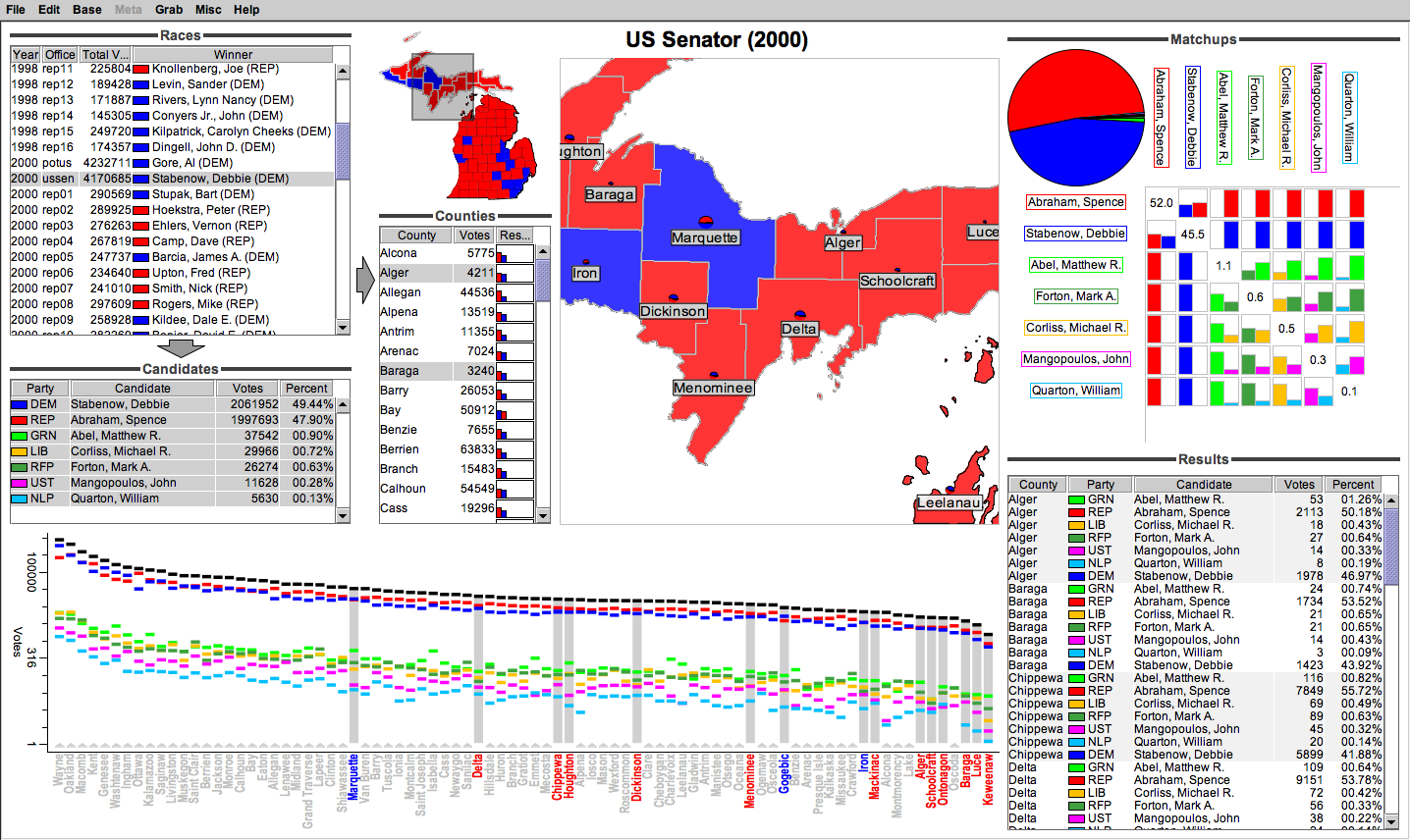
Interface and Interaction
The user starts by selecting a race from a
Races table view that displays summary information for each race, including total votes and winning candidate/party. The user can then select subsets of the candidates and counties involved in that race, in two additional table views. The Candidates table view shows each candidate with their party and the votes they received. The Counties table view shows the total votes cast in each county, alongside nested bar charts that display the proportion of votes cast for each candidate. A fourth Results table view shows a breakdown of the votes for each candidate in each county. Rapid sorting of this table (by clicking in the column headers) allows the user see ordered vote totals for specific counties, parties, or candidates.
A pannable, zoomable map shows the same information for each county geographically; a smaller inset map (above and left) provides an overview for the entire state. As the user zooms in, the main map adds nested pie charts over the winning party color used to fill each county. A portal (rectangular rubberband) in the inset map indicates the region visible in the main map. The user can select counties by clicking inside the corresponding shape boundaries in either the map or inset.
A pie chart grouped with three matrix views shows overall and pairwise breakdown of vote percentages for the selected candidates in the selected counties. These group of views allows the user to see how candidates compare to each other in various geographic regions, as well as to explore the hypothetical absence of certain candidates/parties.
A votes v. county scatterplot uses a logarithmic scale to show vote totals for both major and minor party candidates, from largest to smallest county vote totals. The scatterplot draws all counties with selected ones highlighted. Black rectangles show total votes for each county.
Downloads
Appearances