
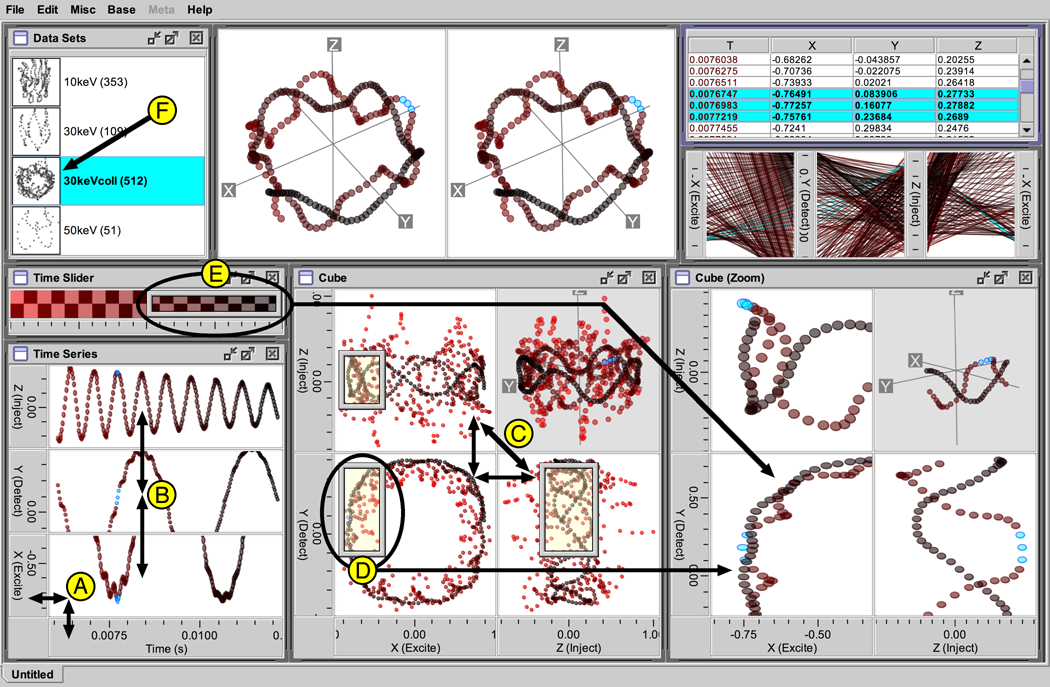
Visualization designers can reproduce a variety of well-known coordination patterns in Improvise. Here I describe six navigation patterns as they have been reproduced in the ions visualization, then four selection and two advanced navigation patterns as reproduced in the elections visualization. All the pictures on this page are derived from screenshots, including the coordinated query graphs which help Improvise users metavisualize coordination structure as they work.
Six Navigation Patterns
The ions visualization contains examples of six navigation coordination patterns:
- Scatterplot+Axes. Axis controls label a plot and provide a way to change X and time independently.
- Synchronized Scrolling. Horizontal synchronized scrolling coordinates three time series plots showing the X, Y, and Z positions of ions over time.
- Scatterplot Matrix. A scatterplot matrix shows the trajectory as seen from three orthogonal sides of the ion trap.
- Overview+Detail. An overview uses a portal (circled) to select the extent of a detail view.
- Perceptual Slider. A perceptual slider enables users to select a visible range of time using a color gradient instead of numeric values.
- Nested Views. The names of available trajectory datasets are accompanied by nested views that project each trajectory into a 3-D view.
A. Scatterplot+Axes
Users browse Improvise visualizations by interacting with views and non-data controls such as checkboxes, textfields, and sliders. Improvise also provides axis controls which are independent of scatterplots, but perform the usual roles of marking, labeling, and handling interaction in one dimension.
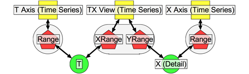
This coordination graph—of a single scatterplot with vertical and horizontal axis controls—shows how panning or zooming in the T axis changes the value of the T range variable, which causes the plot to translate or stretch horizontally. The equivalent interactions in the X axis cause the plot to move vertically. Manipulating the plot changes both variables, causing both axes to update appropriately.
B. Synchronized Scrolling
Views can also be coordinated with each other. Synchronized scrolling is a common form of coordination in which two views are constrained to show the same data items or the same region of a coordinate space.
Scatterplots can be coordinated with each other in the same way that they coordinate with axis controls: through their range properties. This is done by binding the same range variable to the corresponding property of all the plots.
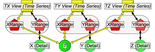
This coordination graph—of three scatterplots with synchronized horizontal scrolling (but independent vertical scrolling)—shows how all three plots update in unison whenever the value of T changes, such as in response to horizontal manipulation of any of the three plots.
The flexibility of property-variable binding makes it possible to construct variations of synchronized scrolling that are two-dimensional (sharing X and Y ranges), horizontal-only (sharing only the X range), vertical-only (sharing only the Y), and crossed (one view shows XY, the other YX).
C. Scatterplot Matrix
Scatterplot matrices show an N-dimensional space as a stairstep arrangement of 2-D scatterplots. Synchronized scrolling in scatterplot matrices is complicated by the need to invert the coordinates of some plots in order to produce expected navigation behavior. Inverting the coordinates of a plot in Improvise is a simple matter of swapping the range variables bound to its live properties.
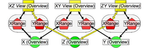
This coordination graph—of a 3-D scatterplot matrix—shows how the shared Z variable synchronizes vertical navigation in the XZ plot with horizontal navigation in the ZY plot.
Building plot matrices is straightforward but tedious; Improvise provides shortcuts for creating common multiview constructions.
D. Overview+Detail
Coordination using the overview+detail technique differs from synchronized scrolling in that the entire area shown in a detail view is synchronized with a subarea of an overview. In Improvise, portals are draggable controls for selecting a rectangular region. Portals can also draw data, acting as lenses above the plots that contain them.
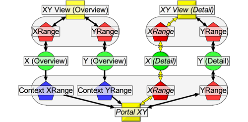
This coordination graph—of a pair of scatterplots and a portal in the overview+detail pattern—show how a portal covers the rectangular region in the overview (its context) that corresponds to the full region visible in the detail view. This construction can be chained to create multiple levels of detail. Omitting the two X (or two Y) range variables produces vertical (or horizontal) versions of overview+detail.
E. Perceptual Slider
Perceptual sliders allow users to select data by thinking visually while acting spatially. To create a perceptual slider based on color, the visualization designer coordinates a portal in a gradient view with one or more other views.
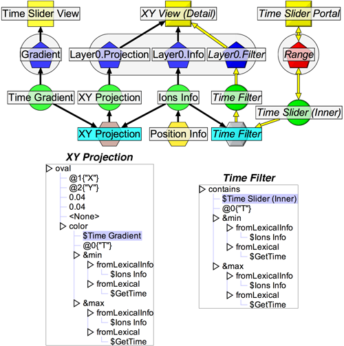
This coordinated query graph shows a scatterplot and a gradient slider in the perceptual slider pattern. The scatterplot draws ovals colored by mapping time values into a color gradient, relative to minimum and maximum values, filtering out (relative) times outside the range selected by the slider portal.
The projection expression used by the scatterplot visually encodes points along the ion trajectory by mapping (normalized) time into the same color gradient shown in the gradient view. The filter expression used by the plot elides points that would fall outside the range of color selected by the portal. Although the user perceives the position of the portal as a selection on color, the selection is actually determined by a range of time values.
F. Nested Views
Nested views enable exploration of a group of related datasets (or subsets of a single large dataset) by displaying each dataset (or subset) in its own view, all of which are contained in a larger view. In Improvise, nested views are special glyphs in which the value being visually encoded is an entire dataset. Because all Improvise views use projection expressions to generate glyphs, they all can contain nested views.
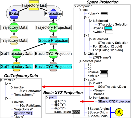
This coordinated query graph shows a list view in the nested view pattern. Each item in the list consists of a formatted file name and a nested 3-D plot. The projection expression that draws each list item generates a nested 3-D view glyph by applying a second projection to the data from the corresponding file. These plots are navigationally coordinated with the main 3-D stereogram through variable operators (A).
Four Selection Patterns and Two Advanced Navigation Patterns
In Improvise, a selection is a bitstring in which the position of bits correspond to the integer identifiers assigned to records when data is accessed during visualization. True bits indicate selected records. Decoupling selections from data in this way allows coordination of views on datasets to be separate from coordination of views on selections. This approach makes it possible to coordinate multiple views using multiple independent selections of the same dataset in a single visualization.
The elections visualization contains examples of four selection and two advanced navigation coordination patterns:
- Shared Selection. Synchronized selection of counties between a table view and a map.
- Selection-Dependent Data. Selecting a race causes the election results for that race to be loaded (from a file) and shown throughout the visualization.
- Selection-Dependent Filtering. A pie chart uses a filter to compare results for selected candidates only.
- Selection-Dependent Projection. A scatterplot highlights selected counties with gray bars.
- Layered Views. A four-layer scatterplot colors counties by winning candidate party.
- Semantic Zoom. Semantic zoom labels counties with nested bar plots at sufficient zoom.
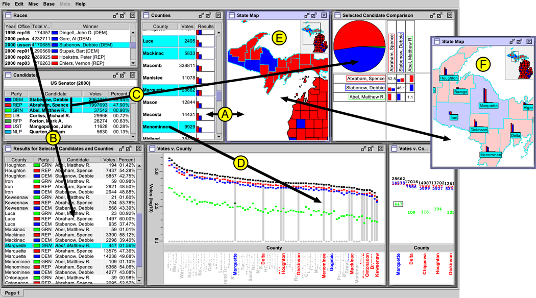
G. Shared Selection
Shared selection is a form of brushing that allows the user to select an item in a view, and see the corresponding item in other views. Selected records are distinguished from unselected records by graphical differentiation defined by the views' visual encodings.
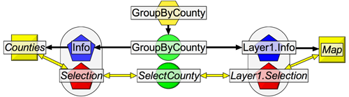
This coordination graph—of shared selection between a table view and a scatterplot—shows how selection of items in either view causes both views to redraw their shared data. The scatterplot draws the 83 counties in Michigan as polygons (read from shapefiles); the table view draws each county as a row of text with a nested bar plot. Selecting items in either view (by clicking shapes or rows) changes the selection variable, causing both views to redraw with the selected items highlighted.
H. Selection-Dependent Data
Users often want to select from multiple related datasets (or subsets of one large dataset) in a single visualization, such as during analysis of a sequence of experiments. Selecting a dataset in one view to show in another view is a form of drill-down. Selection-dependent loading of data in Improvise is performed using an expression that is defined in terms of (1) data that lists the names of (or otherwise identifies) loadable datasets, and (2) a selection on that data.
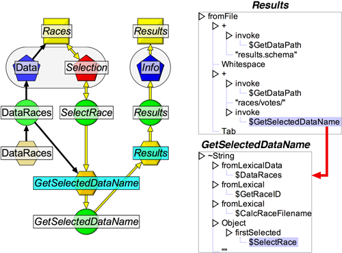
This coordinated query graph shows selection-dependent loading of data. An index on the races dataset maps the record identifier of the first selected race into the name of a file that stores the corresponding voting results. Whenever the user selects an office, the visualization loads data from the corresponding file. Using Infos (derived datasets defined in terms of an expression), the user can specify a file, URL, or database as the source of data to visualize.
I-J. Selection-Dependent Filtering And Projection
Selection-dependent filtering is an asymmetric version of shared selection in which the filtered view differentiates between selected and unselected items by not drawing unselected items instead of highlighting selected ones. Whereas selection-dependent filtering determines the visibility of items, selection-dependent projection determines the appearance of items.
Most visualization systems can coordinate two views so as to highlight the items in one view that correspond with items selected in the other view. Highlighting is usually a fixed function of the type of view, typically implemented as a special background color. By using expression-based projections to determine the entire visual encoding of items in views, highlighting in Improvise is a user-customizable visual differentiation of selected and unselected items. Highlighting can therefore take the form of a special background color, reverse video, a special font, or just about any variation on color or other visual attributes the user can dream up. Customizable highlighting can also be used to avoid conflict with normal visual encoding of items.
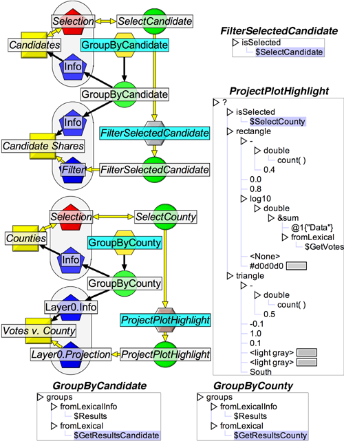
These coordinated query graphs show how views can be indirectly coordinated through filters or projections that depend on selection variables. The filter expression states that for each candidate, draw it only if it is selected and the projection expression states that for each county, draw a rectangle if it is selected, a triangle otherwise. The height of each rectangle is an aggregate of the dataset created by grouping the overall election results by the corresponding county.
The GroupByCandidate and GroupByCounty expressions are examples of a grouping, in which a data set is divided into user-defined equivalence classes. (Groupings are obviously inspired by group-bys in database queries, but are utilized differently.) A grouping calculates a {key, data subset} association table by applying a secondary expression to each record in the full data set. Objects calculated by this secondary expression are the keys; each record is placed in the data subset corresponding to its calculated key.
Info expressions can treat a grouping as a dataset unto itself, or extract particular data subsets by indexing into the grouping with the appropriate key. The former approach is used in this example:
- Counties and candidates are defined as entries in the association tables of two groupings (both on the Results Info from the previous section).
- Selections of counties and candidates actually refer to those entries.
- ProjectPlotHighlight visually encodes each entry by calculating an aggregate on each data subset.
The Candidate Shares pie chart shows vote shares for candidates selected in the Candidates table view. Although both views display the same data, the filtered view elides unselected candidates using an expression defined in terms of the selection. The result is a kind of multi-item details-on-demand that allows comparison of details for selected subsets of items. The Votes v. County scatterplot highlights counties based on whether they are selected in the Counties table view. Although the filter and projection expressions in this example depend on independent selections (one of candidates, one of counties), it is easy to extend them to depend on conjunctions or disjunctions of selections.
K. Layered Views
Layering enables users to apply multiple visual encodings to multiple datasets in a single view. A common use of layering is to visualize a single dataset using a layer to highlight selected items in a lower layer. In Improvise, scatterplots have multiple layers each defined by its own data, selection, projection, and filter properties.
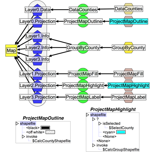
This coordinated query graph shows a four layer plot in which the top three layers draw different projections of the same data. All four layers invoke user-defined expressions (not shown) to load county shapefiles for drawing. The scatterplot draws the map using four different projections. The bottom layer draws all counties. The top three layers fill, highlight, and label only the counties which are involved in the selected election. Drawing labels in the highest layer keeps them from being obscured by shapes in underlying layers. The combination of layering and compound glyphs provides extensive control over the z-order of items drawn in plots.
L. Semantic Zoom
Semantic zoom is a form of details on demand that lets the user see different amounts of detail in a view by zooming in and out. Semantic zoom in Improvise uses expressions that calculate glyphs as a function of a plot's own X and Y ranges.
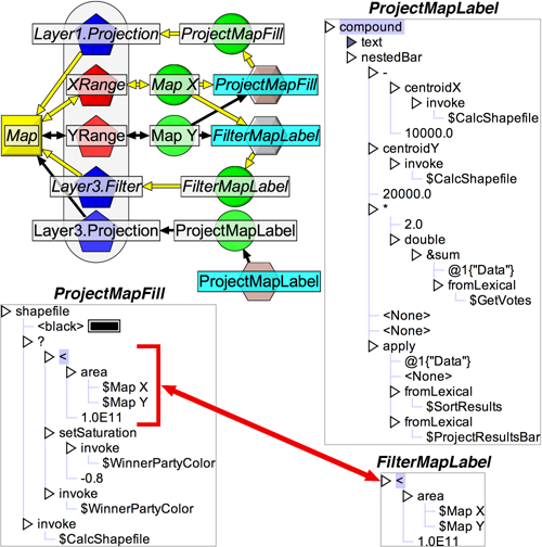
This coordinated query graph—of semantic zoom in the county map—shows how, at sufficient zoom, the top layer draws a centered label and a scaled, nested bar plot for all counties. To make the top layer easier to read, the fill layer reduces the saturation of the winning candidate's party color at the same zoom level.
The county map plot depends on two ranges both directly and indirectly. Although this example demonstrates synchronized zoom between plot layers, the expressions could be edited to make the layers change detail at different zoom levels. One-dimensional zooming and multiple levels of detail are also possible.
References